University Logos
Primary Logo
Secondary Logos



wordmarks
A wordmark is a distinct text-only typographic treatment that only features the name of an organization or institution. It does not contain images, icons, or emblems. These should only be used in place of a logo when the imprint area is too small to fit any of the logo configurations.


Color Variations

Full Color (FC)
Primary color variation for light backgrounds.
Color White (CW)
Primary color variation for dark backgrounds. Good for clear backgrounds.

One Color (1C)
For materials that require only one color. Can be reversed to black or Bulldog Red (PMS 200) for light backgrounds. Good for emboss/deboss and clear backgrounds.
Black and White (BW)
Good for emboss/deboss.
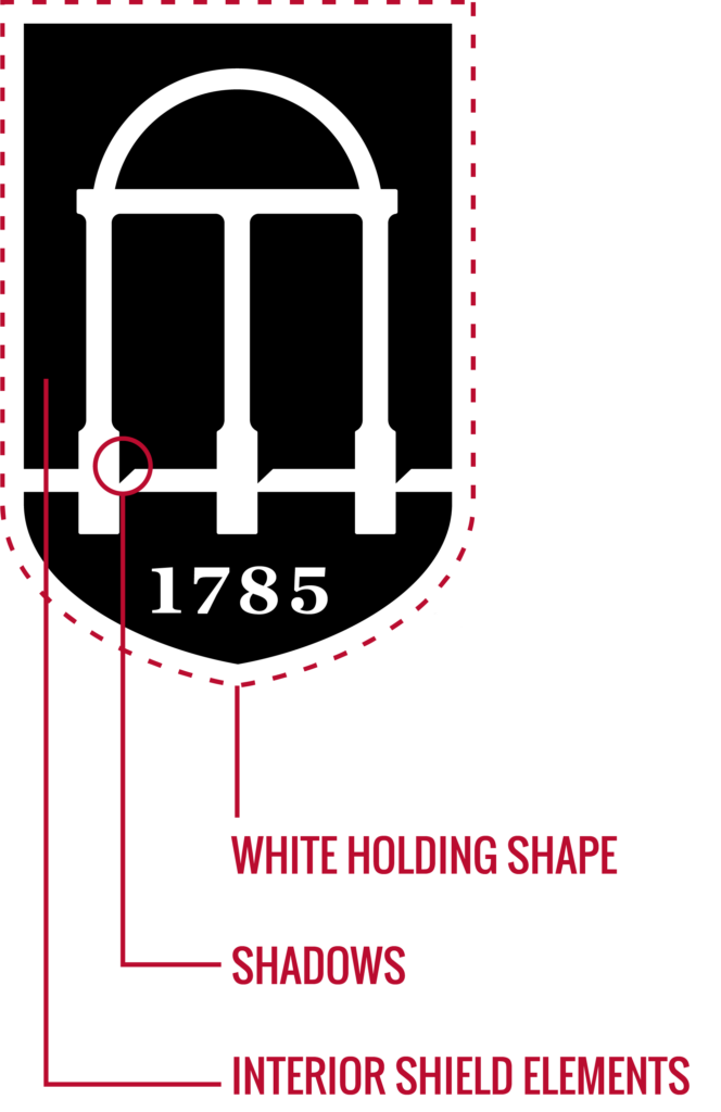
Arch-Shield Icon
White Holding Shape
The white holding shape provides a buffer between the interior shield elements and the background. Do not change its color. All color variations of the logo include the white holding shape.
Interior Shield Elements
These pieces are solid colors in all color variations except the 1C logo, where they are transparent.
The arch-shield icon can never be used on its own.
File formats
| File Type | Description | Usage |
|---|---|---|
| AI | vector file, scalable | |
| PNG | raster file | DIGITAL |
Seal
The university seal is reserved for official documents such as diplomas, transcripts, legally binding documents and materials issued by the Office of the President.

Unit Logos
Level 1 unit logos
Level 1 unit logos are those that identify the 30 colleges and administrative divisions of the University of Georgia, as well as multidisciplinary or highly independent units.


level 2 unit Logos
Level 2 unit logos identify units that fall under a Level 1 unit while meeting one of the criteria listed below. These have the same logo configurations in their logo set as Level 1 units, except for vertical.
A Level 2 unit logo set can be created if a unit:
- falls under multiple Level 1 units.
- represents or serves the institution.
- is an institute or center within a school or college.
level 3 unit Logos
Level 3 unit logos identify the majority of units within schools/units.


Contact the logo liaison for each college or division to request official logo sets and special configurations. Do not create your own logos and do not alter official logos in any way.
logo liaisons
Every Level 1 unit across campus has a logo liaison who is in charge of their unit’s logos. If you need to obtain a different unit’s logo, contact their logo liaison. If you need to have a logo set, special configuration, or social media icon created, contact your unit’s logo liaison to get the process started. They can also guide you as you’re designing materials to help it follow the university brand guidelines.
file formats
| File Type | Description | Usage |
| AI | vector file, scalable | |
| PNG | raster file | DIGITAL |
Promotional artwork can be made for events or initiatives since they don’t get an official UGA logo. It should not incorporate any trademarked elements in our visual identity and must be accompanied by an official UGA logo.
Logo Guidelines
Clear Space
Avoid placing graphics or text in the logo’s immediate vicinity. This helps maintain the logo’s integrity.

For formal and vertical logos, use the “G” as a guide for minimum clear space on all sides.

For horizontal logos, use the combined height of the “University of Georgia” wordmark and the line directly above it as a guide for minimum clear space on all sides.

For the extreme horizontal UGA logo, use the shield height as a guide for minimum clear space on all sides.

For the Georgia Top Shield, use the width of the shield as a guide for minimum clear space on all sides.
logo violations
Consistent presentation is vital in strengthening a brand’s recognizability and impact. Any modification to our logo is therefore prohibited.
- Do not use any logo made before 2022.
- Do not distort.
- Do not alter colors.
- Do not move any part of the logo.
- Do not rotate.
- Do not use the arch-shield icon alone. Keeping the icon and wordmark together strengthens recognizability.
- Do not resize or remove the registered trademark symbol.
- Do not place the logo on inaccessible backgrounds. Use a different color variation of the logo or choose a different background image.
- Do not add a drop shadow or outline.
- Do not substitute any alternate typography for the wordmark.
- Do not alter the icon-to-wordmark proportion
- Avoid placing the logo on rival colors.
- Do not remove the white holding shape.
- Any artwork identifying the university, its units, or any part of the University of Georgia wordmark other than our institutional logo system is considered an alteration and is prohibited.
Always scale the entire logo proportionally. (Hold the SHIFT key while scaling.)
Special Logo Configurations
official logo set vs. special configuration
Official Logo Set – Depending on which level of logo your unit falls under, your official logo set will comprise of a group of logos you are allowed to use as needed.
Special Configuration – Includes any logo configuration developed for your unit by the Division of Marketing & Communication that falls outside of what was provided in your official logo set. These configurations are created on a case-by-case basis when no logo included in your official logo set will fit the space needed. These are only to be used in approved circumstances.
If the name of your department could be confused with another department on campus, then your logo always needs to include the unit/school’s name your department falls under.
Co-Branding
Internal
When several entities within the university equally share affiliation with a program or event, list the entities alphabetically either underneath the university logo or on its right side. When one entity is the major sponsor, use its logo instead of the university logo. List all other affiliated entities alphabetically.
Include enough clear space (the width of the “G” in the formal logo or height of the two lines in the horizontal logo) between the bottom line of text in the logo and the list of units. The text must align with the text in the logo and not appear below the shield.
Use Merriweather Regular font and keep it at a similar proportion in size to the logo as shown in our examples.


External
When a university entity works with affiliated yet independent entities or with outside partners, multiple logos may need to be displayed. The “I-Bar,” a graphic element of the university brand, can be used to separate the logos. If an event is sponsored by UGA, our logo should be first (left or top). If there are more than three logos, no I-Bar is needed between each one.
Make sure there is enough clear space between the UGA logo and the I-bar. Keep the spacing between each logo and I-bar equal on both sides.


While our institutional logos can be co-branded with external entity logos to show partnership, nothing else is allowed to be connected to a UGA logo with an i-bar, line, or any type of separator.
social media icons
To allow for the limited space of social media and app icons, this is the ONLY instance where the whitespace requirement around the logo is exempt. These icons should not be used for any other purpose. If a social icon is needed, the unit/college’s logo liaison can request one for you.


circular configurations
Promotional Items – These configurations may be used when an official logo cannot fit the production space of a specific promotional item, and must be created by the Division of Marketing & Communications. Silver (PMS 877) is the preferred metallic ink or foil.


Metal – These circular configurations are designed for lapel pins, coins, and anniversary medals. Constraints of size, material, and production may vary by item. Must be created by the Division of Marketing & Communications.
Use silver metal whenever possible.


Embroidery
Embroidery is a unique medium that requires special attention to sizing. Department-level logos can be difficult to embroider due to the small lettering involved. If the department name is illegible due to its size, use the affiliated top-level logo and embroider the full department name separately in Trade Gothic Bold No. 20 or Oswald Medium.
Include enough clear space (the width of the “G” in the formal logo or height of the two lines in the horizontal logo) between the bottom line of text in the logo and the name. The embroidered text must align with the text in the logo and not appear below the shield.
Proportional scaling is required at all times. If the width of the wordmark is less than 2.75″ then do not include the date because it is too small to be legible. The minimum size a logo can be embroidered is 1.5″ wide or 2.5″ wide for the wordmark without the shield. Heat transfer is discouraged.


taglines
Taglines, while not recommended, may accompany official logos for special uses, only two lines or less, if they are created by the Division of Marketing & Communications and follow the spacing and font guidelines. Taglines may not be included on name tags. Tagline implementation should be consistent university-wide in order to preserve the visual identity system.

Need A Logo?
university logos
Unit logos
If you are looking for an existing logo, contact the logo liaison that unit falls under to request it.
If you need a new or updated logo, contact the logo liaison your unit falls under to request its creation.
logo liaisons
Every Level 1 unit across campus has a logo liaison who is in charge of their unit’s logos. If you need to obtain a different unit’s logo, contact their logo liaison. If you need to have a logo set, special configuration, or social media icon created, contact your unit’s logo liaison to get the process started. They can also guide you as you’re designing materials to help it follow the university brand guidelines.
