Color
Using color appropriately is one of the easiest ways to make sure our materials reflect a cohesive Georgia brand. Beyond our logo, color is the most recognizable aspect of our brand identity. The elements of our palette have been given names that reflect their inspiration. Using color appropriately is one of the easiest ways to make sure our materials reflect a cohesive Georgia brand.
Accent colors must be limited to no more than 20% of overall design—these should complement the design, not overtake it.
Neutral colors are intended to support the primary color palette and should never be used as the sole color scheme.
Metal
Our brand metal color is silver, which we encourage you to use whenever possible. Silver (PMS 877) is the preferred metallic ink or foil.
Tips for using color
- Our primary colors should be used in every communication; however, they are very bold—a little can go a long way.
- Ensure that foreground and background color contrast passes accessibility standards, including text over images.
- Appreciate the value of white space.
- Remember that our communications must be created to be accessible to all.
- Use tints of neutral colors at 30%, 50%, and 75% to further expand the neutral palette.
Accessibility
In both print and digital design, it is important to ensure everything we create is accessible. Providing sufficient contrast in our designs ensures readability and usability for everyone, including those with visual impairments. Our digital properties and communications must adhere to Section 508 accessibility guidelines. Tools like WebAIM provide a contrast checker to compute contrast ratios defined in WCAG 2.0.
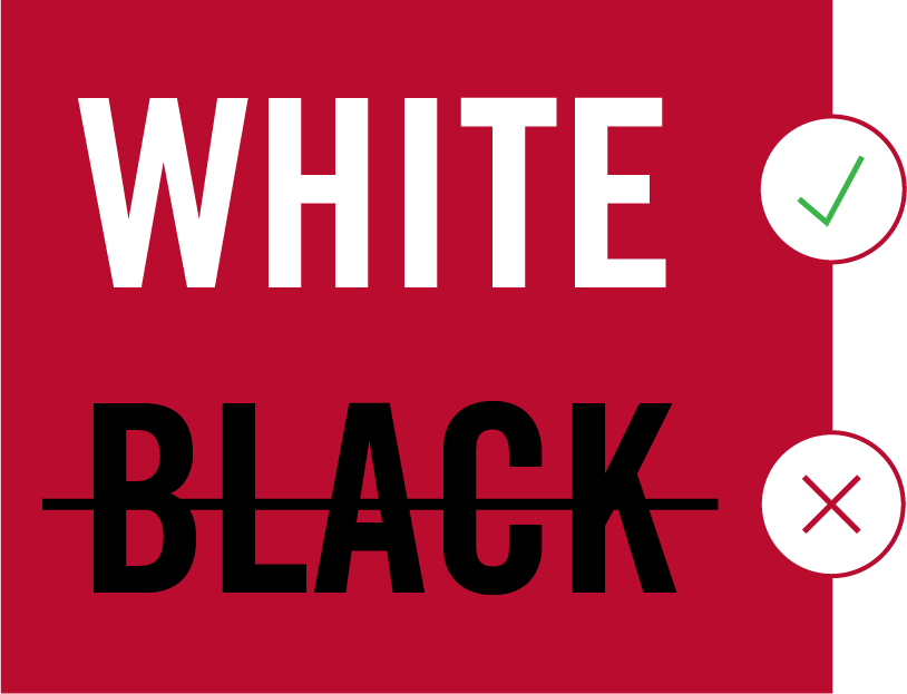


the red and black rule
Avoid placing red text on a black background, or black text on a red background. This combination violates our brand guidelines and does not meet accessibility standards. The same rule applies to primary graphics and any graphics that represent text. When red and black are used together, use white in between to provide sufficient contrast.
Typography
When it is used thoughtfully, typography becomes a powerful brand tool that can add visual meaning to what we communicate. Georgia’s typography communicates clearly and cleanly, and is flexible for a wide range of situations.
Fonts
Primary Sans-Serif
OSWALD
Oswald is our primary sans-serif family and works best for headlines, subheads, and infographics. The only approved weights are light and medium.
Styles

Primary Serif
Merriweather
For more sophisticated situations, Merriweather, our serif font family, is available. It works best for headlines and body copy.
Styles

Secondary Sans-Serif
Merriweather Sans
Merriweather Sans, our secondary sans-serif, performs well at small sizes and in longer-form text.
Styles

Secondary Serif
Georgia
Georgia, our secondary serif, is an excellent font for body copy, documents, and dense text blocks.
Styles

- Oswald, Merriweather, and Merriweather Sans are available for free download from Google Fonts. Georgia is a core font already installed in most applications.
- If you previously purchased Trade Gothic Standard, you may continue to use that font for printed materials. However, Oswald is still preferable for digital use.
Graphic Elements
Our brand has a number of graphic tools that work together to distinguish us from our peers and create a look that is instantly recognizable. When they are used consistently, these elements create continuity within our family of materials, across a variety of media. All of these can found in our Download Center.
arch illustrations
Because the Arch is represented in the visual identity, illustrations of the Arch must not look like logo alterations. To ensure this, make sure any illustration of the Arch is detailed enough to be clearly distinguished from the arch-shield icon. An Arch illustration must include:
- the ribbed details of each column.
- the lightbulbs at the top of each side.
- the floral embellishments in the upper portion.


chapel bell


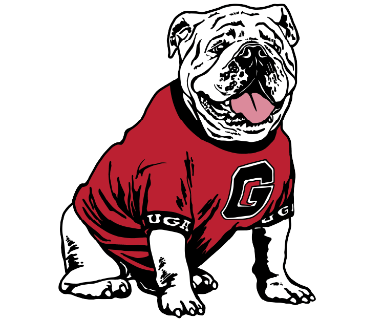
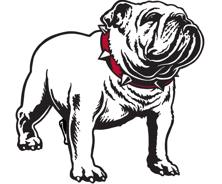
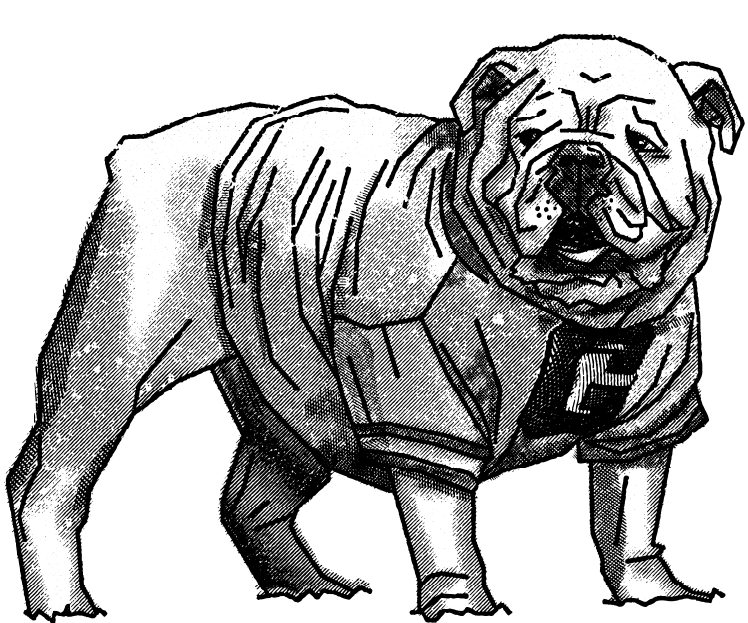
academic-approved Bulldogs
These bulldog illustrations have been approved by Athletics for use by academic units. These should be used in lieu of the Athletics bulldogs which are registered under UGAAA.


Guidelines
- No other bulldog illustrations can be created/used, including silhouettes of bulldogs. Doing so would break Athletics brand guidelines.
- Nothing can be added to or taken away from these bulldog illustrations.
- Although these icons are not registered trademarks, the use of the bulldog illustrations still requires prior approval from the Trademarks Manager.
Shield
The shield is derived from the arch-shield icon. Because it is directly tied to the logo, the shield is the most unique graphic element for the university.

Usage
Graphic Element
Use the shield to add visual interest to a communication piece, as a background element or as a highlighter or separator of information.

Container
Position the shield on top of an image. Select both the shield and image, right-click, and select “make clipping mask.”
Use images that will have enough contrast with the background when placed inside the shield.

Rotation
The shield is derived from our logo. Never rotate it.

Scaling
The bottom portion of the shield should always maintain the same curvature.
- To scale the shield proportionally, hold down SHIFT and drag.
- To shorten or lengthen the shield without changing the curvature of the bottom portion, drag the two anchor points on the top end with the Direct Selection Tool.


I-Bar
The I-bar alludes to a pillar of the university’s iconic Arch. Add energy to a piece by placing it between blocks of text or underneath important phrases for emphasis.

Scaling
Make sure to maintain the proportions of the column head and base.
- Scale proportionally (SHIFT + drag) to the desired column thickness.
- Use the Direct Selection Tool to select only the anchor points at one end of the column. Hold SHIFT and drag to desired length. (Holding SHIFT keeps the column straight.)


Rotation
The column should only be used in a vertical or horizontal orientation.

Underlining for Emphasis
Place a single horizontal column beneath a word or phrase for emphasis.

Banners
Banners can function as an indicator for messaging or as a container for typography. Our banner element contains text and points the reader to important information.

Usage
Use the banner as a container for headlines or other important information.

Rotation
Banners may only be horizontal, pointing to the left, right, or down. Do not rotate the banners to any other orientation.

Resizing
The pointed end of the banner should always maintain the same angle.
- To scale the banner proportionally, hold down SHIFT and drag.
- To shorten or lengthen the banner without changing the angle of the pointed end, drag the two anchor points on the flat end of the banner with the Direct Selection Tool.

Borders
Borders can be a sophisticated graphic element; using them thoughtfully can add elegance to any piece.


Intended Uses


icons
This is a sample of the icons offered in our download center.
Photography
Photography is a compelling tool for portraying our community’s diverse and dynamic nature. Our photography captures the Georgia experience and connects with people in ways that words cannot. What we say can describe what we are doing to challenge convention and shape the future. But our photography actually shows it.
Style
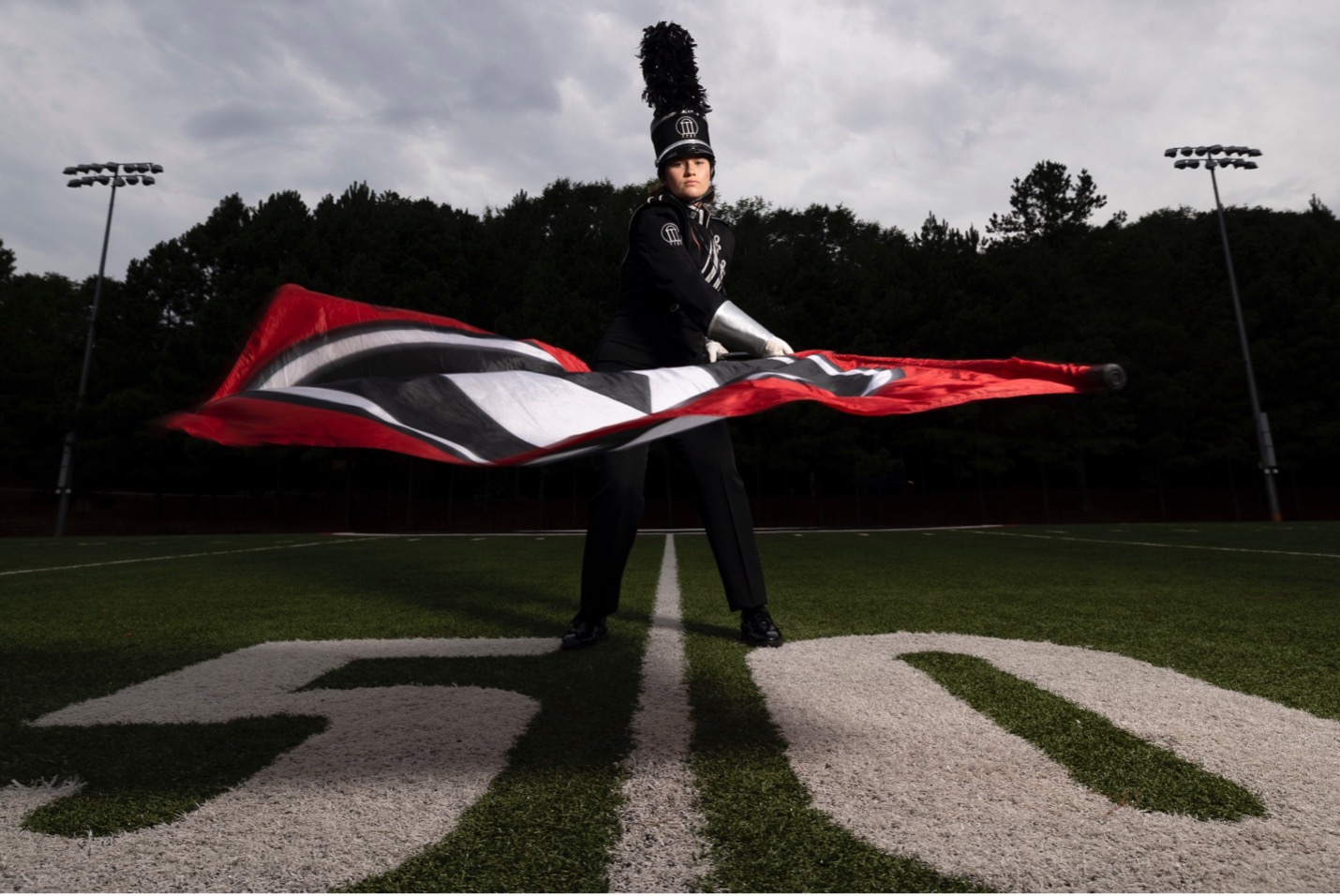
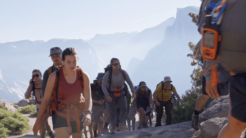
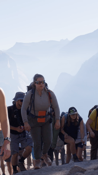
Our photography focuses on authentic storytelling. Our images should be confident and natural. Images can be broken down into four categories: portraits, campus life, details, and campus icons.
Portraiture
Our portraits tell the subject’s story using everything from the context of the setting to the look and feel on their face. These photos are usually in a controlled environment where the subject is aware of the camera. These portraits can be warm and lighthearted, using a good balance of ambient, natural, and/or artificial lighting. Our portraits can also be highly conceptual portraits with dramatic lighting to emphasize a concept related to the subject.


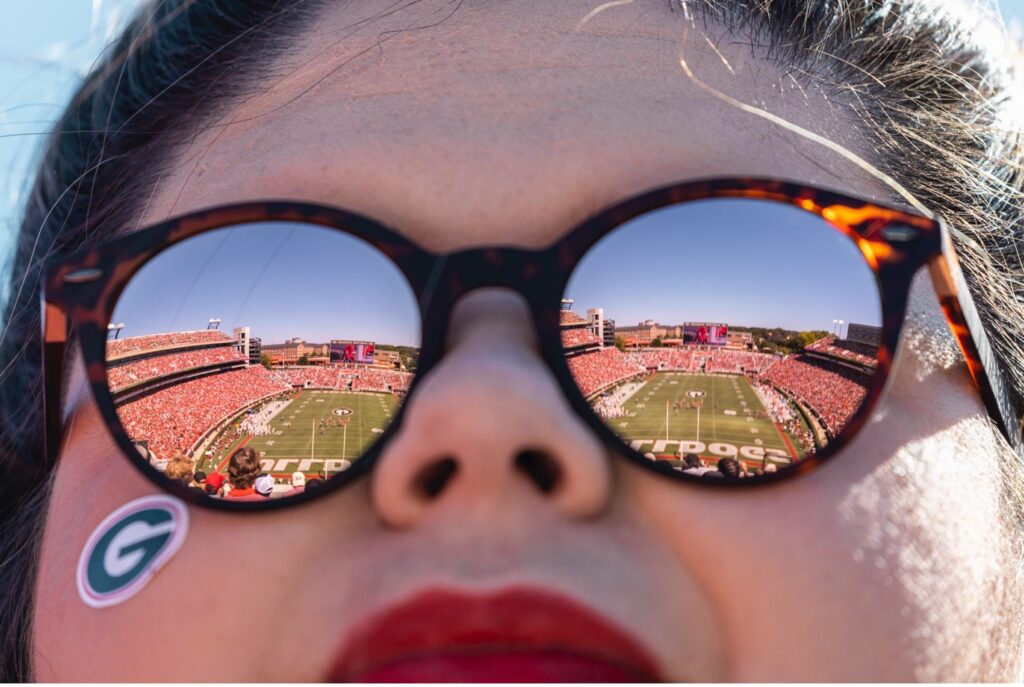
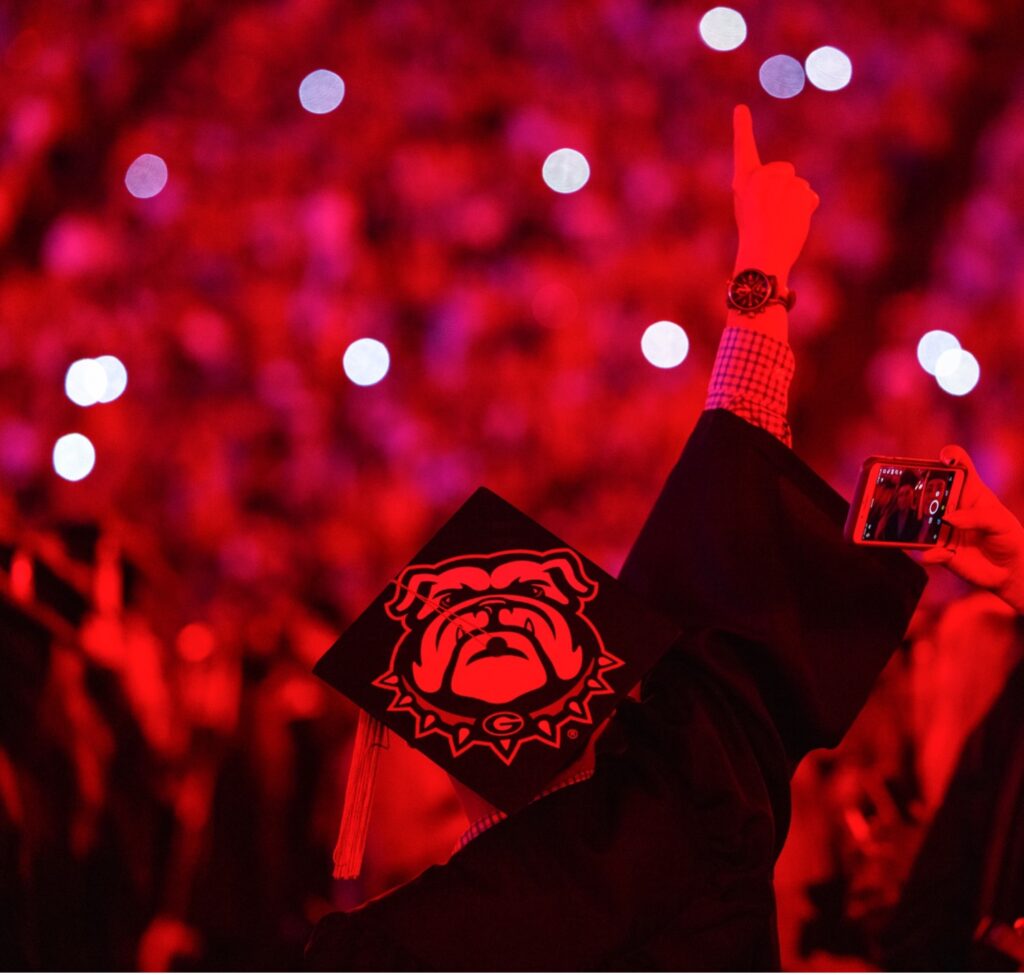
Campus Life
These images capture moments occurring on campus: classroom, lab, student life, events, etc. The images should reflect the authenticity of the everyday situation, with subjects appearing unaware of the camera.
These images may show peer-to-peer collaborations along with faculty and student interaction in their natural learning environments. Active research, outreach, and service-related photos also fall into this category. We should strive to show a diverse mix of gender and ethnicity in these images to represent our campus community.


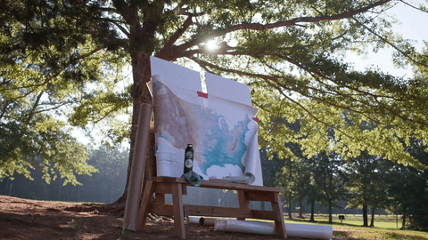
Details
Object-based photography plays a significant role in our communications and in our photo library. These images serve as a window into our areas of study and the tools of our trades. Use interesting and unexpected perspectives to make the images dynamic. Framing can vary from macro to wide-angle and everything in between—whatever helps showcase the object best.


Campus Landscapes and Icons
Images of campus like the Arch, Chapel Bell, Sanford Stadium, North Campus architecture, and special spots on our campus are ideal for wide use in our communications. Photos like these are crucial in distinguishing Georgia from other universities and reminding our audiences of their connection with our university.


Photography Tips
- Try to use natural sources of light whenever possible.
- For in-studio portraits, lighting can help make the subject seem more confident.
- To avoid unnatural angles, never rotate the camera to an angle other than 90 degrees.
alt text
Photos and graphics posted online should be accompanied by back-end alt text. Whereas cutlines (or captions) appear on the screen and can provide an explanation or context for an image, alt text is used on the back end and should describe the image itself.
“Alternative text” is necessary to make our content accessible to the widest possible audience. Not only is alt text often read aloud for people with visual impairments, but it will also appear in place of an image that doesn’t load.
Alt text should be concise and descriptive. Focus on the main aspects of the image.
Some things to consider:
- What stands out?
- What are the main takeaways?
- How would you describe it in a single tweet?

Videography
Videos are a tool best used sparingly and strategically.
- General B-Roll is available via Digital Arch to assist units when creating videos.
- Adding video assets to a story can help drive overall engagement.
- Video can help grab users’ attention on social media and drive traffic to a story.
- Video can help explain difficult-to-understand topics.
General Guidelines
- You “hook” an audience in the first 5 seconds of a video.
- Jump right into the content to retain audiences.
graphics
- Videos should be branded using approved assets. UGA-branded outro graphics are provided on the brand site. If you create your own, outro graphics should be simple and contain the UGA logo at a minimum and be similar to the branded templates.
- Avoid using an intro slide or graphic unless absolutely necessary.
- If in doubt, adding a simple fade-in to the logo file is perfectly acceptable.
- Avoid using a fade-out on the end bumper. Just let the video end on the logo.
text and lower 3rds
- Lower 3rds are graphic elements that display on the lower third of the screen used to identify a speaker. An available After Effects brand template should be used for Lower 3rds.
- They always include at least a first and last name and often also include details like job title and university affiliation.
- Lower 3rds should be legible and last for a minimum of 5 seconds. If you can’t read it in the time it is on screen, the audience can’t either.
closed captioning
- All public-facing videos with spoken audio should be closed captioned.
- Some platforms, like Facebook and YouTube, allow you to upload a caption file after you upload your video. These platforms allow users to turn captions on as needed.
- Other platforms, such as Instagram, do not offer a way to upload a caption file. On these platforms, you must “burn in” the captions. This involves exporting the video with the captions permanently displayed on screen.
- Captions should never cover another on-screen text element, such as lower 3rds. Instead, captions should jump to the top of the screen when other text elements are on screen.
- Rev.com offers captioning services for a reasonable fee. Rev will provide a caption file for you to upload to the platform of your choice. For an additional fee, Rev will also burn captions into your video file for you.
Quick tip – If you need a caption file AND a video file with burned-in captions, there is no need to submit your video and pay twice. Rev will always provide you with a caption file you can upload to a platform that accepts it. The burned-in video file will be in addition to the regularly provided file on the checkout page.
watermarks
- If using an institutional logo as a video watermark, use the one color (1C) in white.
- Never use the shield icon on its own. Use the Top Shield configuration instead.
- Recommended placement is top right corner of video.
- Never place is near text.