
Logos
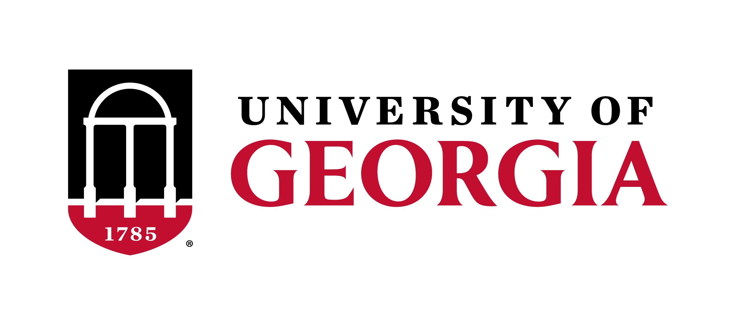
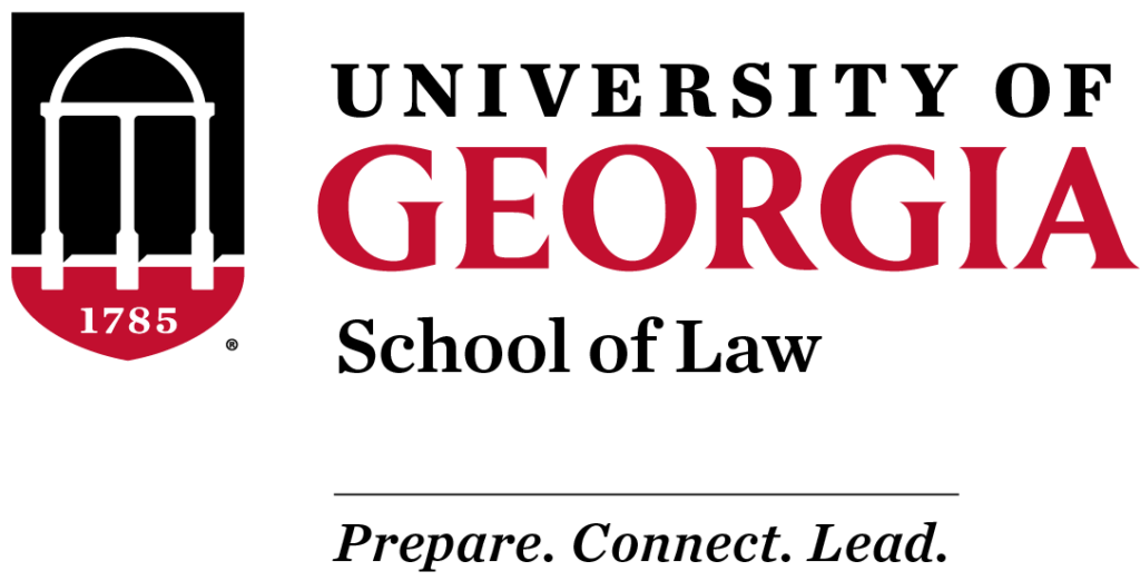
The University of Georgia logo is the strongest visible representation of the entire university. It embodies who we are and unites our different voices so that together we are stronger than the sum of our parts. More than a mere visual mark, it is the face of the organization and should be consistent across all mediums.
Table of Contents
University Logos
Primary Logo
Secondary Logos


Color Variations
File Formats
| File Type | Description | Usage |
|---|---|---|
| AI | vector file, scalable | |
| PNG | raster file | DIGITAL |
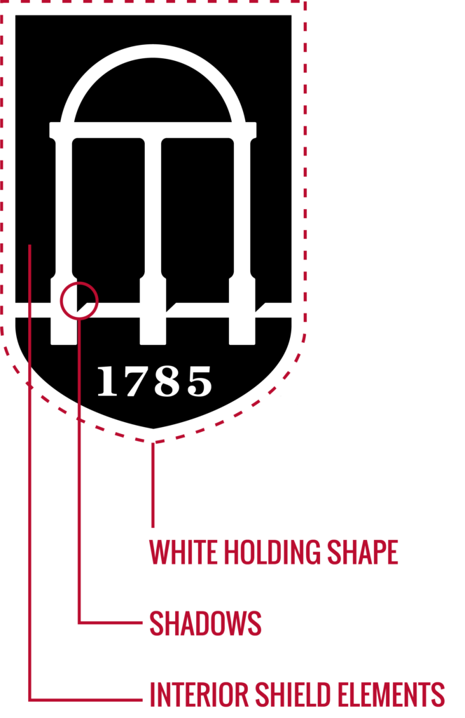
Arch-Shield Icon
White Holding Shape
The white holding shape provides a buffer between the interior shield elements and the background. Do not change its color. All color variations of the logo include the white holding shape.
Interior Shield Elements
These pieces are solid colors in all color variations except the 1C logo, where they are transparent.
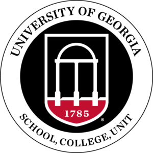
Seal

Unit Logos
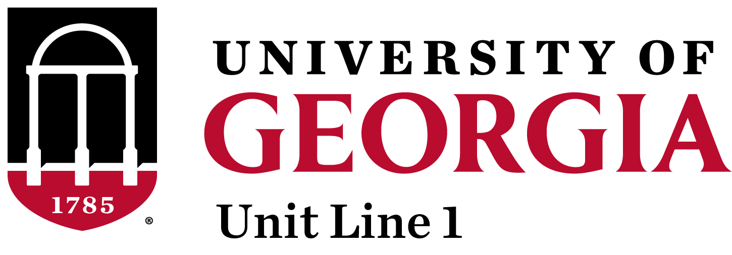
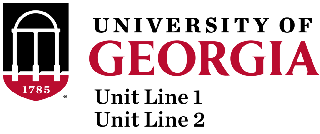
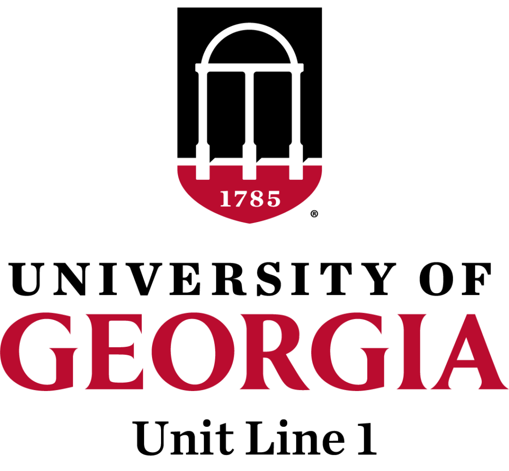
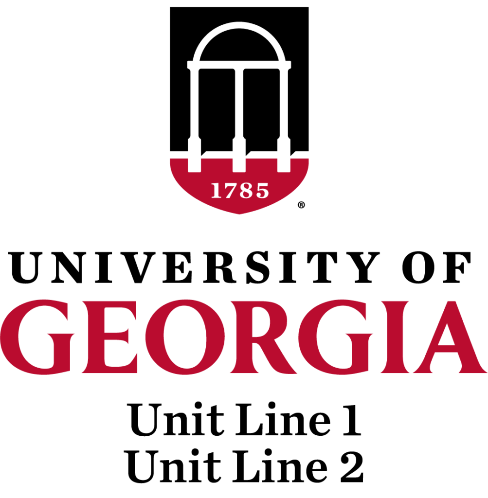
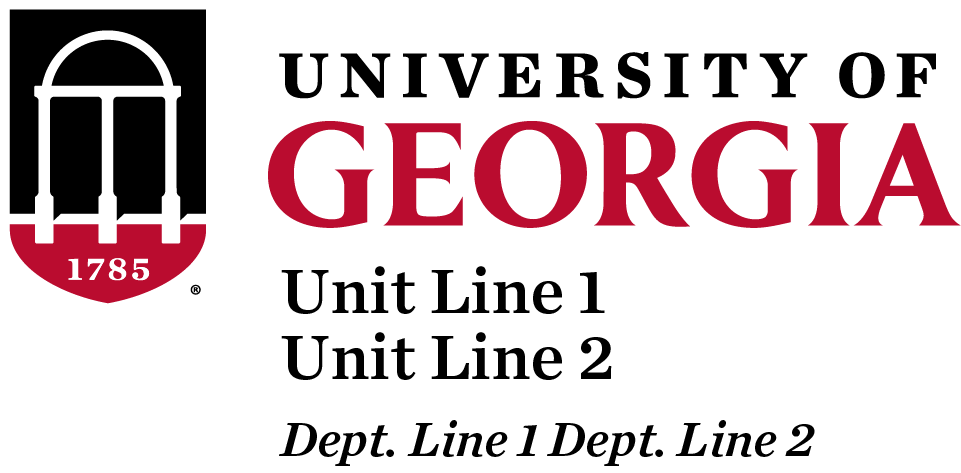
Units, Departments, and Programs
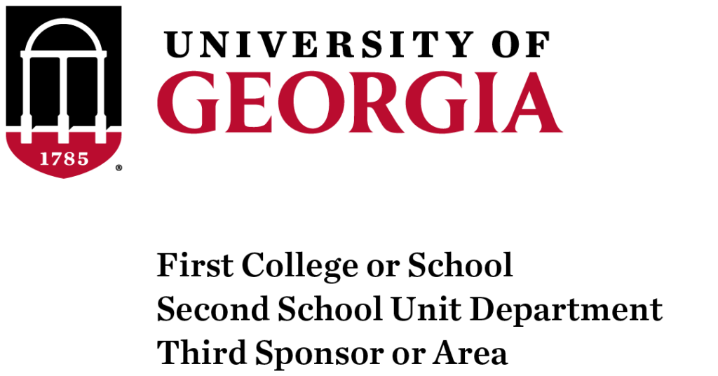
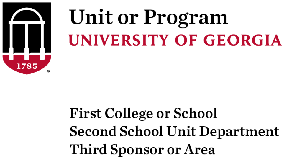
Top level logos are those that identify the 30 colleges and administrative divisions of the University of Georgia, as well as multidisciplinary or highly independent units. For horizontal unit logos, use the combined height of the “University of Georgia” wordmark and the line directly above it as a guide for minimum clear space on all sides.


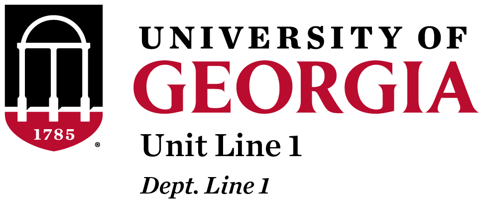
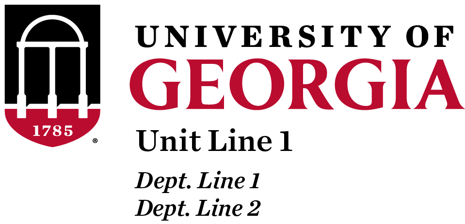
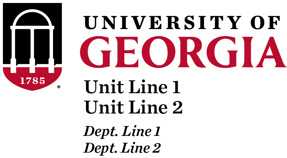
Department Logos
Department level logos are configured based on hierarchy.


Special Configurations
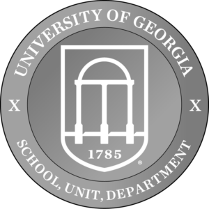
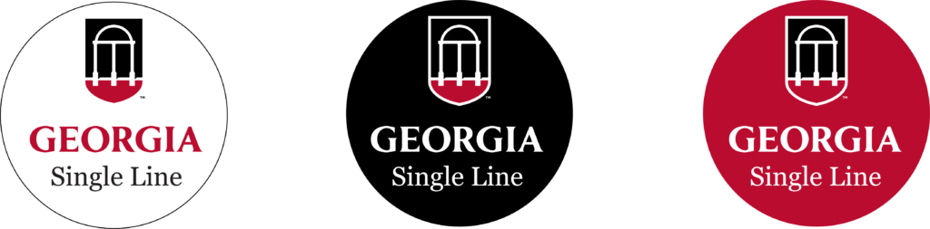
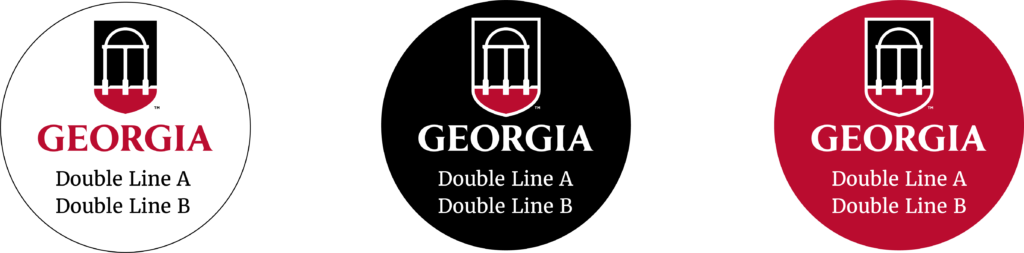
Circular Configurations
Promotional Items – These configurations may be used when an official logo cannot fit the production space of a specific promotional item, and must be created by the Division of Marketing & Communications. Silver (PMS 877) is the preferred metallic ink or foil.


Taglines

Usage
Apparel, Merchandise, and Promotional Items
-
- Promotional items larger than 2″ must include an institutional logo.
- Artwork cannot include the institution’s name, the full name of the requesting unit, or the words “School” or “College.” Including these names creates a modified logo, which is prohibited. The official logo of the unit mentioned in the artwork must be used.
- When using multiple logos, academic units must lead with their official logo, placing other logos in a secondary position.
Clear Space
![]()
![]()
![]()
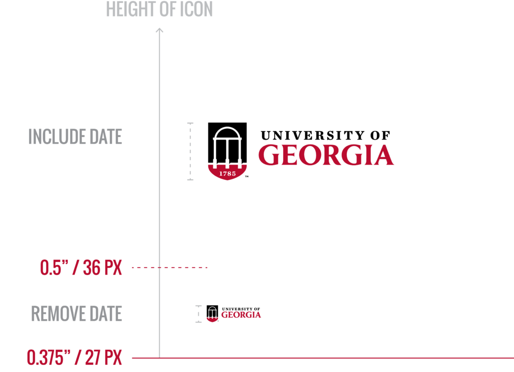
Minimum Size
Prohibitions
Consistent presentation is vital in strengthening a brand’s recognizability and impact. Any modification to our logo is therefore prohibited.
- Do not distort.
- Do not alter colors.
- Do not move any part of the logo.
- Do not rotate.
- Do not use the arch-shield icon alone. Keeping the icon and wordmark together strengthens recognizability.
- Do not place the logo on inaccessible backgrounds. Use a different color variation of the logo or choose a different background image.
- Do not add a drop shadow or outline.
- Do not substitute any alternate typography for the wordmark.
- Do not alter the icon-to-wordmark proportion
- Avoid placing the logo on rival colors.
- Do not remove the white holding shape.
- Do not use any logo made before 2022.
- Any artwork identifying the university, its units, or any part of the University of Georgia wordmark other than our institutional logo system is considered an alteration and is prohibited.
Co-Branding
Internal

External
When a university entity works with affiliated yet independent entities or with outside partners, multiple logos may need to be displayed. The “I-Bar,” a graphic element of the university brand, can be used to separate the logos. If an event is sponsored by UGA, our logo should be first (left or top). If there are more than three logos, no I-Bar is needed between each one.


Embroidery
Embroidery is a unique medium that requires special attention to sizing. Department-level logos can be difficult to embroider due to the small lettering involved. If the department name is illegible due to its size, use the affiliated top-level logo and embroider the department name separately in Trade Gothic Bold No. 20 or Oswald Medium. Include enough clearance space (the width of the “G” in the formal logo or height of the two lines in the horizontal logo) between the name and the logo. The embroidered text must align with the text in the logo and not appear below the shield. Proportional scaling is required at all times.If the width of the wordmark is less than 2.75″ then do not include the date because it is too small to be legible. The minimum size a logo can be embroidered is 1.5″ wide or 2.5″ wide for the wordmark without the shield. Heat transfer is discouraged.


Embossing & Debossing
Social Media Icons
To allow for the limited space of social media and app icons, this is the ONLY instance where the whitespace requirement around the logo is exempt. These icons should not be used for any other purpose. If a social icon is needed, the unit/college’s logo liaison can request one for you by emailing Whitney Mathisen.
FAQ
What defines a logo?
A logo is the simplest visual representation of an entity. It identifies the entity like a person’s name identifies the person. A logo may be a wordmark (a graphic created only from letters), an emblem (a graphic created with no words) or a combination of both. For the University of Georgia, only logos created by the Division of Marketing & Communications from the visual identity system are considered official. Never create alternate graphics to identify the university or its units.
Promotional graphics may be created for temporary events or initiatives, but they must not incorporate any elements of the visual identity (the arch-shield icon, the University of Georgia wordmark). Instead, leverage the university brand by using the recommended promotional graphic arrangement. Keeping the university’s logos distinct and its elements exclusive helps strengthen the recognizability of UGA’s visual identity and consequently strengthens the recognizability of the university itself.
Who can use university-level logos?
University-level logos have been made available for public download. However, usage must comply with trademark policy.
Who can use unit logos?
University trademark policy also applies to individual unit logos. Contact the logo liaison for each unit for usage approval and access.
Can student groups use university trademarks (including logos)?
A student group’s access to university trademarks is determined by the group’s status. Four categories of student group statuses exist. See the Student Affairs trademark approval process.
What is the difference between a logo and a trademark?
A trademark is any graphic or verbiage legally registered and owned by an entity. Logos are a specific type of university trademark.
Can I use illustrated versions of the Arch?
Because the Arch is represented in the visual identity, illustrations of the Arch must not look like logo alterations. To ensure this, make sure any illustration of the Arch is detailed enough to be clearly distinguished from the arch-shield icon. An Arch illustration must include:
- the ribbed details of each column.
- the lightbulbs at the top of each side.
- the floral embellishments in the upper portion.
What is considered an alteration of the university’s logos?
Any artwork identifying the university, its units, or any part of the University of Georgia wordmark other than our institutional logo system is considered an alteration and is prohibited.
What is the purpose of the trademark symbols on university logos?
The trademark symbol indicates that the University of Georgia is in the process of registering the mark in question as its property. Keeping it intact discourages unauthorized use and protects the university’s reputation.
Can I remove the trademark symbol from university logos?
No. The trademark symbol must be kept intact on all logos to protect the university’s reputation.
Why is clear space important? How is it defined?
Clear space protects the integrity of logos. When text or other graphics are placed too closely to a logo, it becomes difficult to recognize what is part of the logo and what is not. Over time, such misuse weakens the recognizability of the logo and the entity it represents. If, for example, a non-university entity’s name is placed too closely to the university logo on an event advertisement, the viewer can mistake the outside entity as part of the university instead of as a separate partner.
For ease of use, clear space guidelines have been derived directly from the logos’ characteristics. Keep in mind that these are minimum requirements, and using more clear space is encouraged when possible.